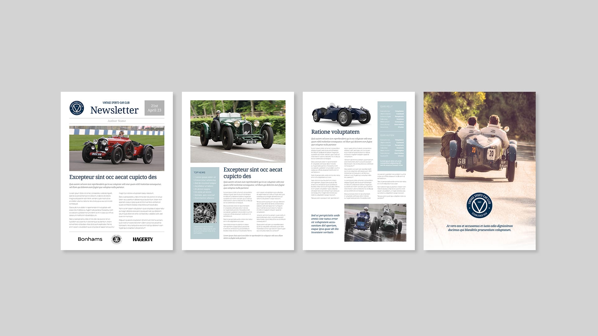
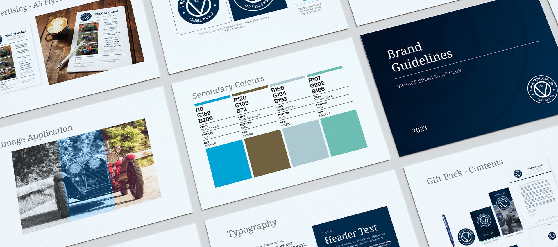
The Vintage Sports-Car Club was established in 1934 and today has an international membership of over 6,000. It celebrates the cars from a specific time in history by organising competitive and social events throughout the year, at places like Silverstone, Oulton Park, Cadwell, and so on. The ethos really does centre upon using the machines as they were intended, not keeping them sealed away only to gaze upon. With the advent of electrically powered cars now upon us, this club and the cars it is based on seem more relevant than ever in telling the story of our automotive past. This was the club’s first branding refresh for over half a century.
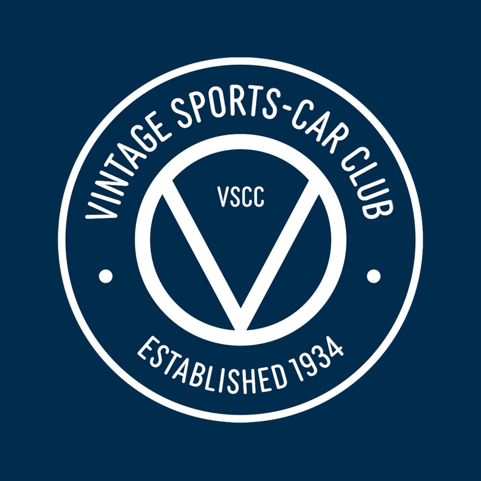
The Old Logo
The club logo has, since its inception in the 1930s, contained reference to St Christopher, using an image and the words “Regarde St Christophe et va-t-en rassuré”. The main problem was that all of this detail within a logo made it almost impossible to reduce in size, which in turn meant that reproduction on clothing, or in digital, meant that the detail was often lost, or blurred. This was very much an evolution of a club badge, to continue the spirit of the original, making it more impactful on screen and on club regalia.
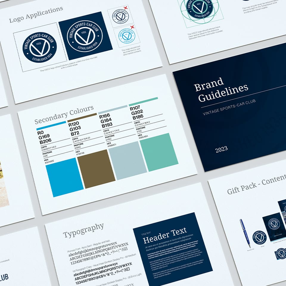
The New Brand
The chosen typeface is now more timeless and has the ‘stamp’ appeal of the original. The lines are simpler and the ‘V’ - which has been an ever present in some form - remains, but now pays homage to the version in the original club logo. The colour is retained, the St Christopher removed and the formation date has been added.
The Result
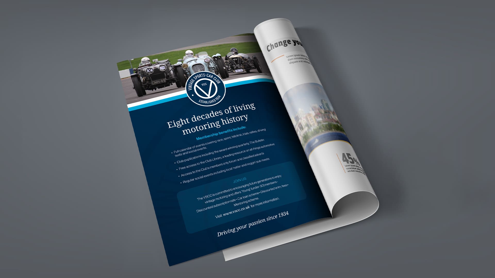
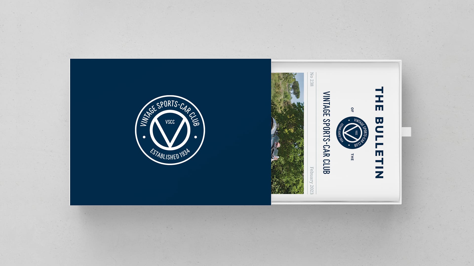
A clear, evolutionary interpretation of the club’s badge, which will help boost their impact in the digital space. A clear set of brand guidelines for the club’s output across many different media and at motorsport events. 2024 sees the club celebrate their 90th anniversary – watch this space.
Vintage Sports-Car Club
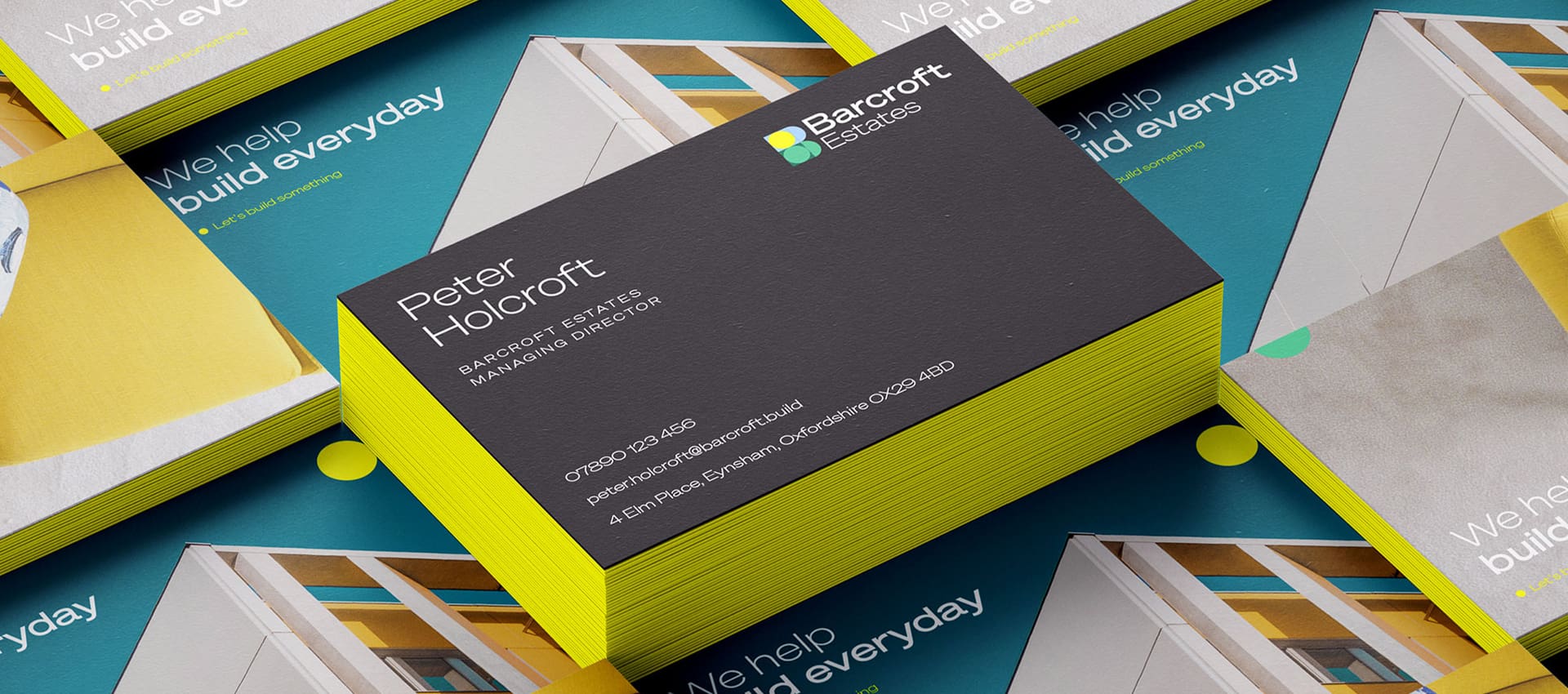
Barcroft Estates is a new company formed by two highly experienced property people. They’re focused on assisting with and delivering often-complicated commercial property projects. They wanted to stand out in this field from their competitors, and move away from what they considered a ‘typical’ commercial development feel.
The Brand
Bold Palettes and sans serifs in various weights. Photography was chosen to focus on specific but beautiful detail from landscape and architectural images, which echoed the personality and colour in the logo, and hints at the specialism of the company, which is rooted in their attention to detail.
The Website
The site need to appeal to a broad selection of people, most of whom will be looking at it to check provenance and browse similar projects. It is not primarily for selling, more to showcase what they are working on, what has completed and to talk about the sector.
The Result
This fresh-out-the-box brand now stands out in the sector and communicates a clear purpose with style.
@Arrive Create Ltd. All rights reserved. 128 City Road, London, EC1V 2NX Shuttlefish is a trading name of Arrive Create Ltd and is registered in England and Wales. Registration number: 15003247