Rebrand a group of care homes to unite them under one identity, but which also allows each home to be individual. The homes are very different from each other and the services vary from 1-2-1 dementia care, through to residential and nursing.
The Method
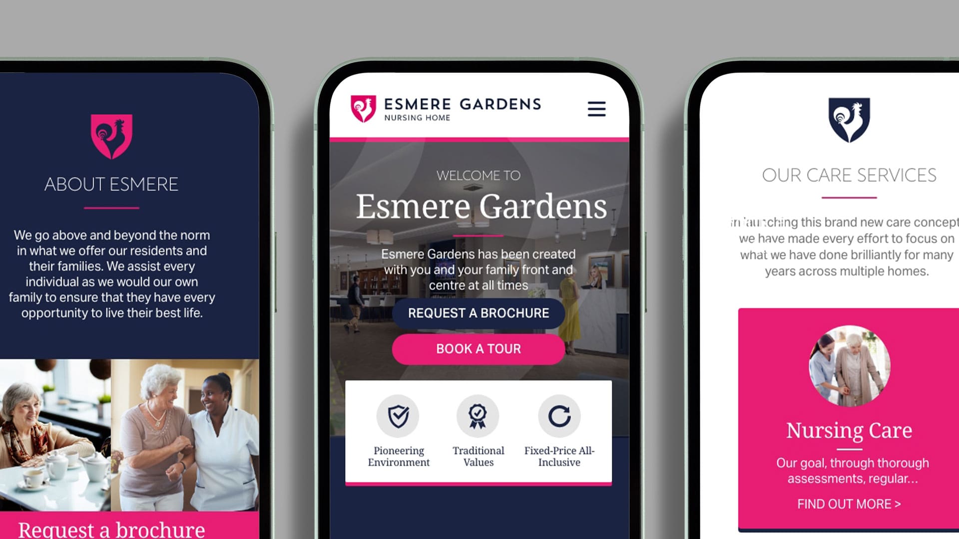
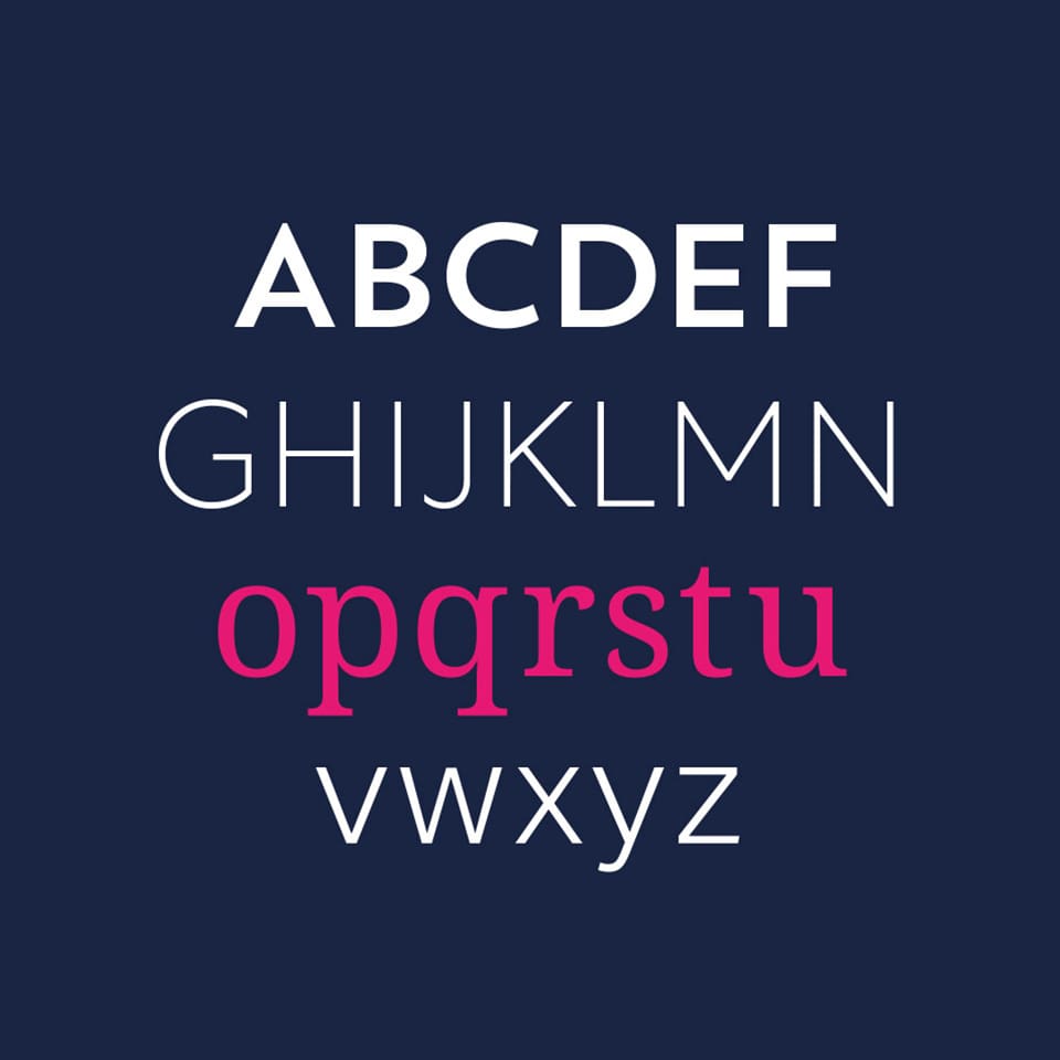
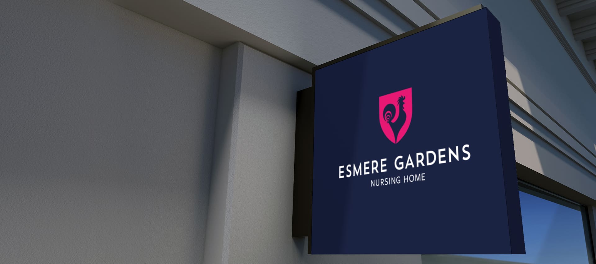
We identified a conservative background navy blue colour to be the basis, and a modern, sans serif Title font for the main lettering. To go with this, we created a number of concepts based around elements from the family heraldry. A modern cockerel icon was chosen, within a shield, for continuity from the existing logo.
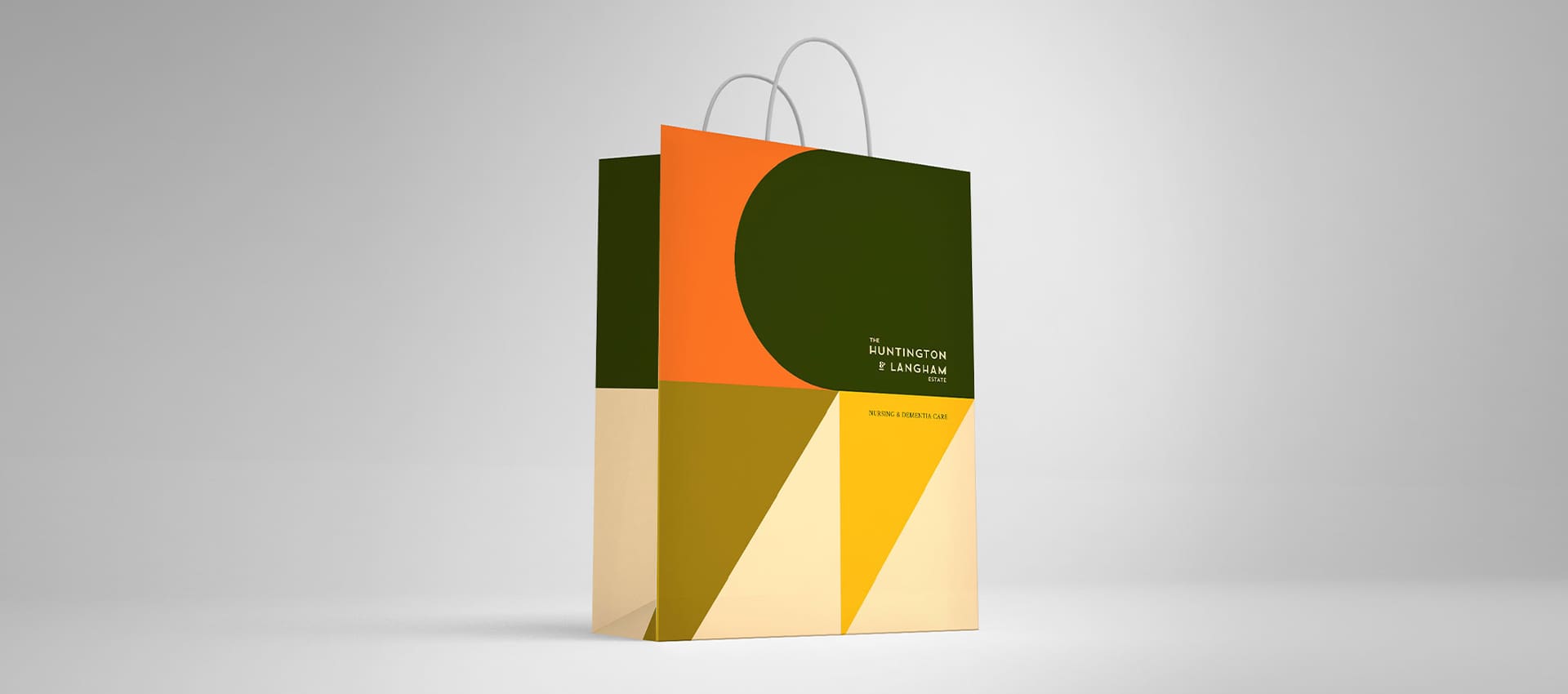
We then created colour palettes for each of the homes, choosing complementary colours which contrasted highly with the dark blue. The main company logo can also be presented on light or dark, to be adapted where needed.
The Results
A family of brands with clear guidelines and instructions on how to use them. The colour palette for each home can lean towards the vivid colour, or the darker blue depending on the context – so for Summer fetes and social media, or internal docs and T&Cs – everything is covered. The logomark in particular works well in print and is a nod to the company’s history, while the bold lines lend themselves well to being used in a largely digital space.
Esmere Gardens Care Home
Rebrand a group of care homes to unite them under one identity, but which also allows each home to be individual. The homes are very different from each other and the services vary from 1-2-1 dementia care, through to residential and nursing.
The Method
We identified a conservative background navy blue colour to be the basis, and a modern, sans serif Title font for the main lettering. To go with this, we created a number of concepts based around elements from the family heraldry. A modern cockerel icon was chosen, within a shield, for continuity from the existing logo.
We then created colour palettes for each of the homes, choosing complementary colours which contrasted highly with the dark blue. The main company logo can also be presented on light or dark, to be adapted where needed.
The Results
A family of brands with clear guidelines and instructions on how to use them. The colour palette for each home can lean towards the vivid colour, or the darker blue depending on the context – so for Summer fetes and social media, or internal docs and T&Cs – everything is covered. The logomark in particular works well in print and is a nod to the company’s history, while the bold lines lend themselves well to being used in a largely digital space.
@Arrive Create Ltd. All rights reserved. 128 City Road, London, EC1V 2NX Shuttlefish is a trading name of Arrive Create Ltd and is registered in England and Wales. Registration number: 15003247