
“Don’t ever diminish the power of words. Words move hearts and hearts move limbs.” – Hamza Yusuf
Typefaces eh. Extraordinarily detailed and ingeniously simple sets of graphic rules which represent the words and languages we speak. So impossibly massive a topic, so evocative and also very divisive. They can amplify and simplify messages, they can turn serious into silly and they cause arguments. Well, in design circles they can cause arguments. These and countless more reasons are why it’s important to do take a few minutes to do bit of research first, however small. Be warned though, it can become and obsession very quickly, such is the ubiquity and availability of these wonderful collections.
Ever since Guttenberg (Johannes, not Steve) democratized the written word with his movable typefaces and his press, in the Fifteenth Century, there has been an ever-expanding choice of typefaces, to the point where people even had opinions on them – take the sans serifs that proliferate modern design and for which you can thank William Caslon – they were widely rebuked at the time of their creation – unthinkable now!
Many moons (approximately two centuries) later, the inclusion of a selection of typefaces for the user to pick from on their own shiny new personal computer was undoubtedly the biggest change in bringing typeface design to the masses. It’s something we don’t think twice about these days but can you imagine being given that choice for the first time? From rigid digital characters formed in green, from the same rectangular grid, suddenly you were presented with the option of multiple crisp, sculpted black images on a white background, just like the words you read every day in print. For that you can thank the late Apple founder and typeface obsessive, Steve Jobs. It possibly felt like a bit of a novelty at the time – an embellishment, not a necessity – but by sharing his passion with the world he changed the way the average person thought about type and typefaces.
Since the early days of personal computing, the world of typefaces has exploded; Today, there is a dizzying array of every possible bend and twist of type you could possibly imagine. Some of them are barely legible, some are masterpieces, some are almost indistinguishable from a more famous type, some are for kids, some are just bizarre and some…..well, some of them go rogue! They become sentient beings in their own right, never to be recaptured and squeezed back into the bottle. They’re out there forever.
This rogue band of fonts change over time, they’re seductive at first, often capturing a fleeting zeitgeist and designers and keen amateurs get lured in. By the time they realize what’s happening it’s too late. Before you know it, that strapline that looked so good on the Company Report you did last week is now on Uncle Reg’s Brexit Party Campaign poster. What have you done?
I know you’ve probably read some blogs like this before and this is the bit where I whine on about Comic Sans appearing in my local newspaper. I’m not here to bang that drum. Do you know what, as I’ve got older, I have developed a special regard for Comic Sans – IT WILL NOT DIE – and fair play to that. When it was created for Microsoft’s Child-oriented software, “Bob”, it worked and it still does for certain things involving pre-school clubs and such, so we’ll leave the beleaguered Comic Sans out of this. Incidentally, I have an ongoing league table in my head of the best inappropriate used of this font. The current leader is a sign on a generator on the Isle of Wight which proclaims in navy blue underlines comic sans “Danger of Death. Keep Out”.
Here is a quick pick of the typefaces whose use make me drop to my knees and ask “why?” while looking at the sky with shaking, clenched fists. Except I’m from Birmingham, England, so what actually happens is I look briefly heavenward and then tut to myself.
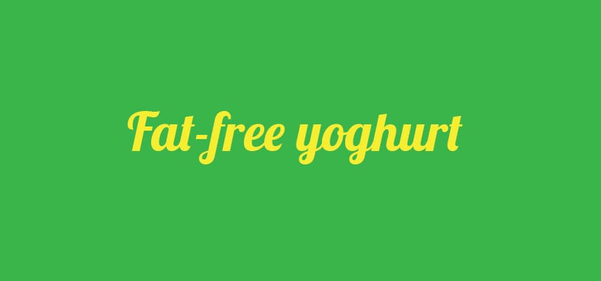
When this one came out, the internet went mad for it. In 2010, this fluid, fresh, joined-up typeface went from unheard-of to everywhere in what seemed like zero time. Confession time: I even used it in italic heavyweight form for the title of my band at the time. I know, I know. I think the realization dawned that I needed to take a look in the mirror was when I saw it on the back of a supermarket own-brand yoghurt declaring it to be 0% fat. You’ll now see it everywhere from home-designed logos to straplines on holidays for the over 50s and, as I’ve pointed out already, bands that want to appear ‘a bit funky’ – and loss-leading dairy products. This article gives you a bit more detail on what went wrong!
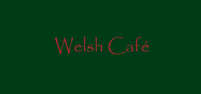
This one is so widely talked about on design blogs the world over, reaching a frenzy in 2010 after the design community realsied that the title of the blockbuster film Avatar ha actually used the typeface! You can read a bit more about the history of the hate here. This was one 20-something designer’s first font design in 1982. Take a bow Chris Costello. Nearly 40 years on and my eye-rolling and tutting at this one is aimed predominantly the two businesses in which this typeface seems to rule supreme. Yoga studios (anywhere) and hospitality businesses in Wales. Cross the border into the beautiful principality and Papyrus is everywhere. I have put this down to the fact that it does seem to sit well next to the Welsh Dragon. So in conclusion, unless you’re putting on a glitzy, Tutenkamen-themed party, stay away from the font. And Welsh cafes, come on – move away from the Papyrus with your hands above your head!
There’s nothing inherently bad or annoying about this one, it’s the laziness of its application that makes it monotonous, if it’s even possible for a typeface to become so. When choosing a title or logo font, Century Gothic offers perfectly circular characters, uniform weight and an all-round clean, modern style. But then some clever bod suggests that as well as the four-letter logo ‘we could just use this for all of our comms’ and so it begins – Emails, letters, business cards, the lot. Finally, the brochure and the website become a chore to look through. If you’re going to use this typeface, do so sparingly. Once it is being used on more than one word it starts to lose its impact,. It is not easy to read swathes of text in and in 2022 it actually looks dated.
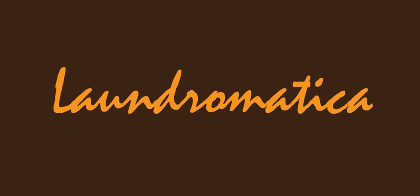
I actually like seeing this one. It’s like a fuzzy reminder of how limited font choice used to be. It’s had its day as a serious font choice and so the only examples of it still in public view are from a long time ago, often on a faded sign above a launderette (or any other business which uses punn-y names – barbers were another before they all became beardy and cool). It was also one of the first typefaces created to emulate handwriting (it was based on the creator’s own hand in the 1950s). Its ubiquity is assured by its age and it appears everywhere from a ZZ Top album to the Launderama near you. My favourite occurrence of it is when it’s uncovered by renovation of a shop or shop sign. I saw one only last month declaring “New Year Deals on Package Tours” – perfect! But you – don’t you go using it. The font police are watching!
Where to start? It emulates handwriting, often being used as a sample signature for where you need to sign your name or similar. I can live with this, I get it. It’s not this that makes it so annoying. It’s restaurants again. Your food is great, I can see you’ve spent so much time on getting the décor and the ambience in this place just right – go you! But wait, what’s this? Excuse me waiter, there’s Bradley Hand on my menu? (interrogative inflection intended). Oh my days. Either use a simple, legible typeface, or actually write the menu yourself. Please.
The reality is I’m getting a bit wound-up on purpose to add a bit of narrative to a blog post. It’s not a dealbreaker for a business and it won’t ruin any livelihoods to use any of these typefaces. But what it does do is to remove a layer of individuality from your branding, however basic you may consider your branding to be. Instead of your values, personality and your message being communicated, your potential customers see everything they’ve ever seen written in that typeface. You can blame Microsoft Word if you like, these are – all bar Lobster – available in MS Word and their use largely the result of “I’m sick of Times New Roman, what else is there” searching through the font menu.
So if you’re choosing a typeface for some branding, signage, a website – anything which your customers will read, really, have a quick look at what’s out there before settling for one of these ne’er-do-wells. A quick web search for “great font pairings” will throw up bags of inspiration and provide you something to talk with your designer about. Or simply have a browse through the ever-expanding cornucopia that is Google Fonts. Before you join the stampede towards one of the above, have a look at around, there are over 100,000 different ones to choose from.
Obviously, we love typefaces, it’s part of what we do and in design-land, creating your own typeface is probably one of those things on a lot of design bucket lists, but so complex is it to create something that works in every situation, they can take years, even decades to create and perfect. Fancy learning more or even having a go yourself? Check out these resources:
Turn Your handwriting into a font
Browse and download quality free fonts


